Display circular ProgressBar in Android
Hello friends!
In the past we have discussed about creating and displaying a basic ProgressBar in Android. A ProgressBar, as the name suggests is basically used to indicate the progress of an operation.
By default the progress bar is a spinning wheel (an indeterminate indicator). However, one can also create a circular ProgressBar by applying certain custom attributes. More such styles can be found over here.
In order to create a circular progress bar we need to add a new XML file in the drawable folder. If no "drawable" folder exists then you can always create one.
Let’s name our XML as circular_progress_bar.xml and add the following code!
circular_progress_bar.xml
<?xml version="1.0" encoding="utf-8"?>
<rotate xmlns:android="http://schemas.android.com/apk/res/android"
    android:fromDegrees="90"
    android:pivotX="50%"
    android:pivotY="50%"
    android:toDegrees="360">

    <shape
        android:innerRadiusRatio="3"
        android:shape="ring"
        android:thicknessRatio="7.0">
        <gradient
            android:centerColor="#007DD6"
            android:endColor="#007DD6"
            android:startColor="#007DD6"
            android:angle="0"
            android:type="sweep"
            android:useLevel="false" />
    </shape>

</rotate>
Now, inside any of your existing Activity layouts, add a new ProgressBar widget and apply the above drawable.
activity_main.xml
....
 <ProgressBar
                android:id="@+id/progressBar"
                style="?android:attr/progressBarStyleHorizontal"
                android:layout_width="150dp"
                android:layout_height="150dp"
                android:layout_centerHorizontal="true"
                android:indeterminate="false"
                android:max="100"
                android:progressDrawable="@drawable/circular_progress_bar" />
...
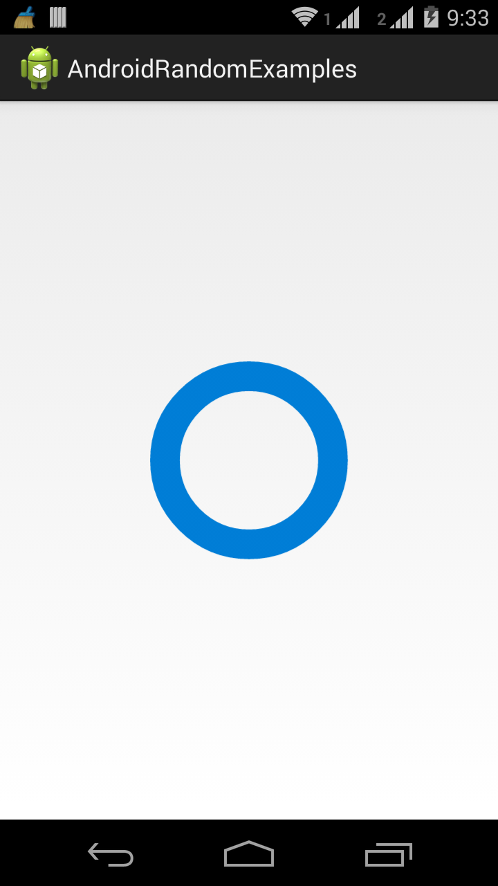
Save all changes. Make sure no errors are present. Run the Android application on a physical device and you should see the following output!

